UES PRE-WAR TRANSFORMATION

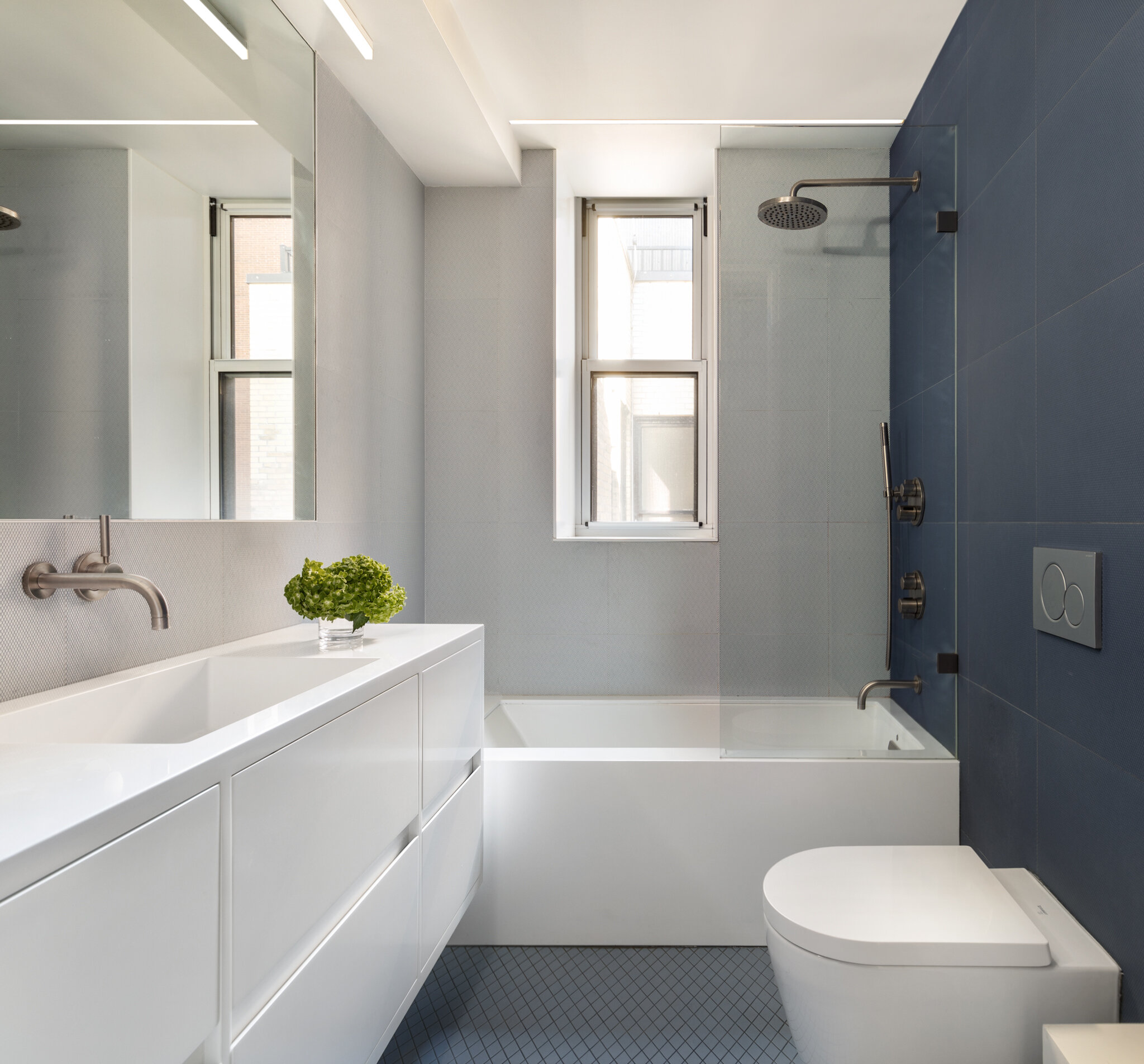
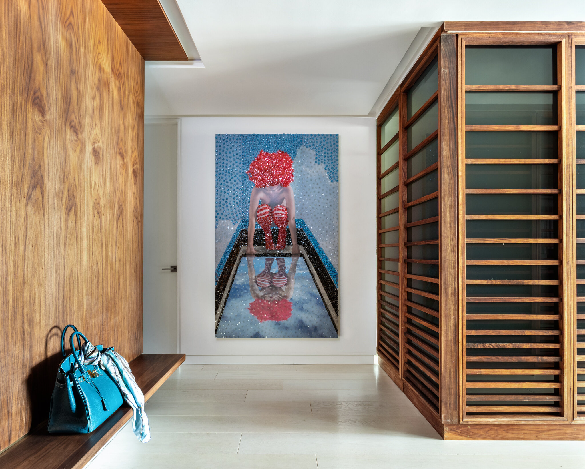
There was something charming about this Pre-War Coop apartment when we first met it, a top floor unit situated only 2 blocks east of Central Park. How could we not like it, the space had been meticulously maintained by the previous owners for over 50 years. It was a snapshot in time, a veritable collection of custom millwork and furniture in Art Deco, Mid-century modern and Bauhaus styles, with the appropriate wrinkles and wear that one would expect.
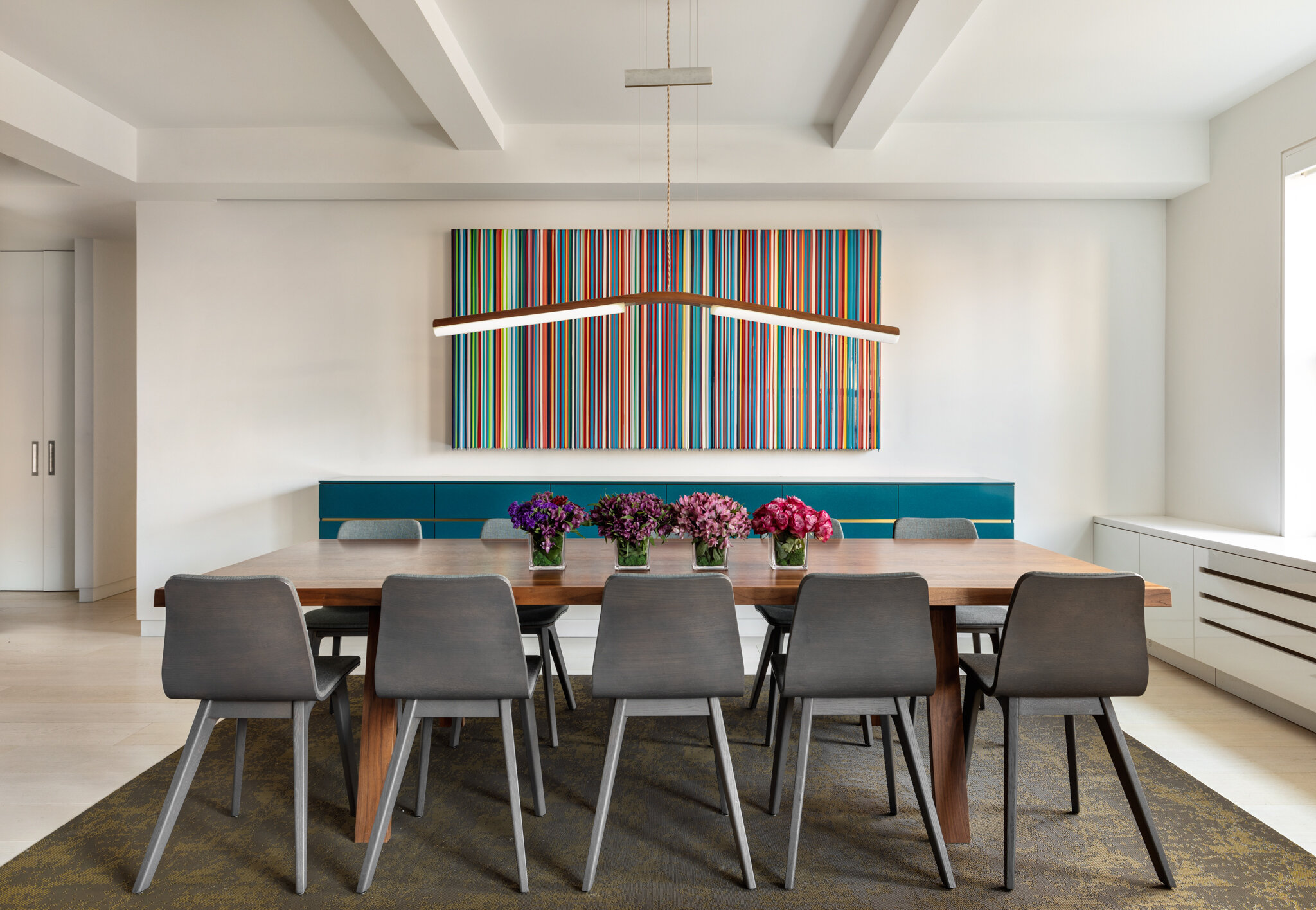
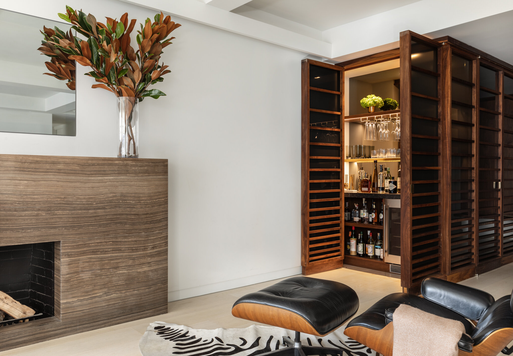
[upper left] The previous dining room, now a bedroom, was once a closed off formal room fit for entertaining purposes, while the living room [lower left] acted as formal sitting area. Now, both the living and dining areas are combined to one big open family room with large windows and southern exposure. The combined rooms are versatile for hanging out as a family, relaxing by the fire, entertaining with the adjacent bar, piano practices, online study and of course, dining. The mirror over the fireplace is also a flat screen tv.
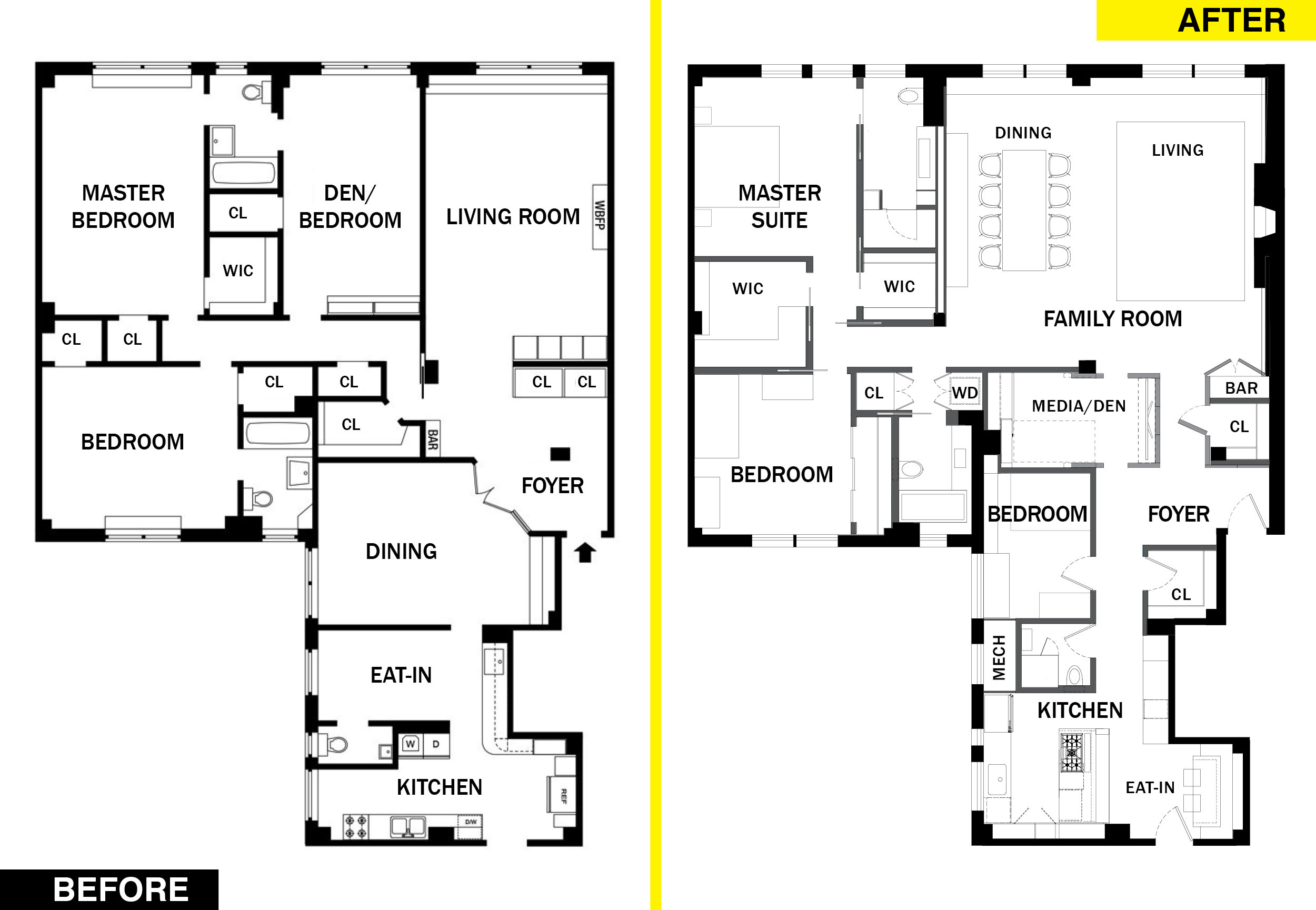
Preserving the past may be appealing to certain audiences but the goal for our clients, a young, vibrant family of six (which later grew to 8, if you include the bird and the dog), was to first make this space their own, tailored around the way they love to live. They are a modern, active, close-knit family that likes to play, engage, and be together, but also needs solitude at certain times of any given day. Working closely with them and collaborating with their DSDFF (dearest seasoned designer family friend) throughout the process, weetu took on the challenge with the intent to preserve the spirit of the Pre-War building features, while modernizing the details and de-compartmentalizing the layout and providing flexibility in its functions.
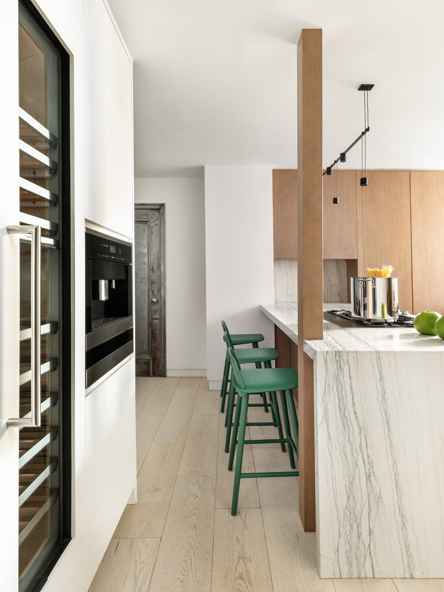
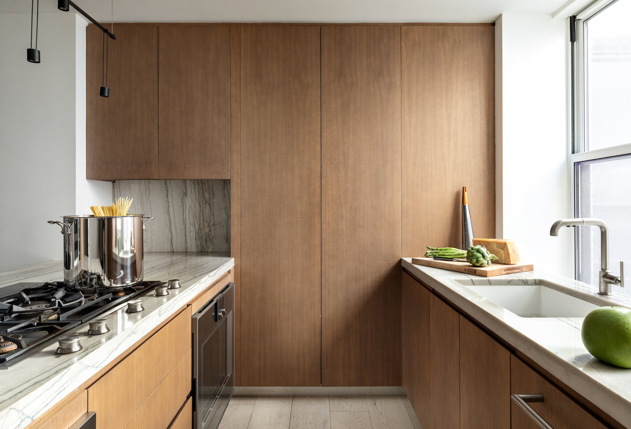
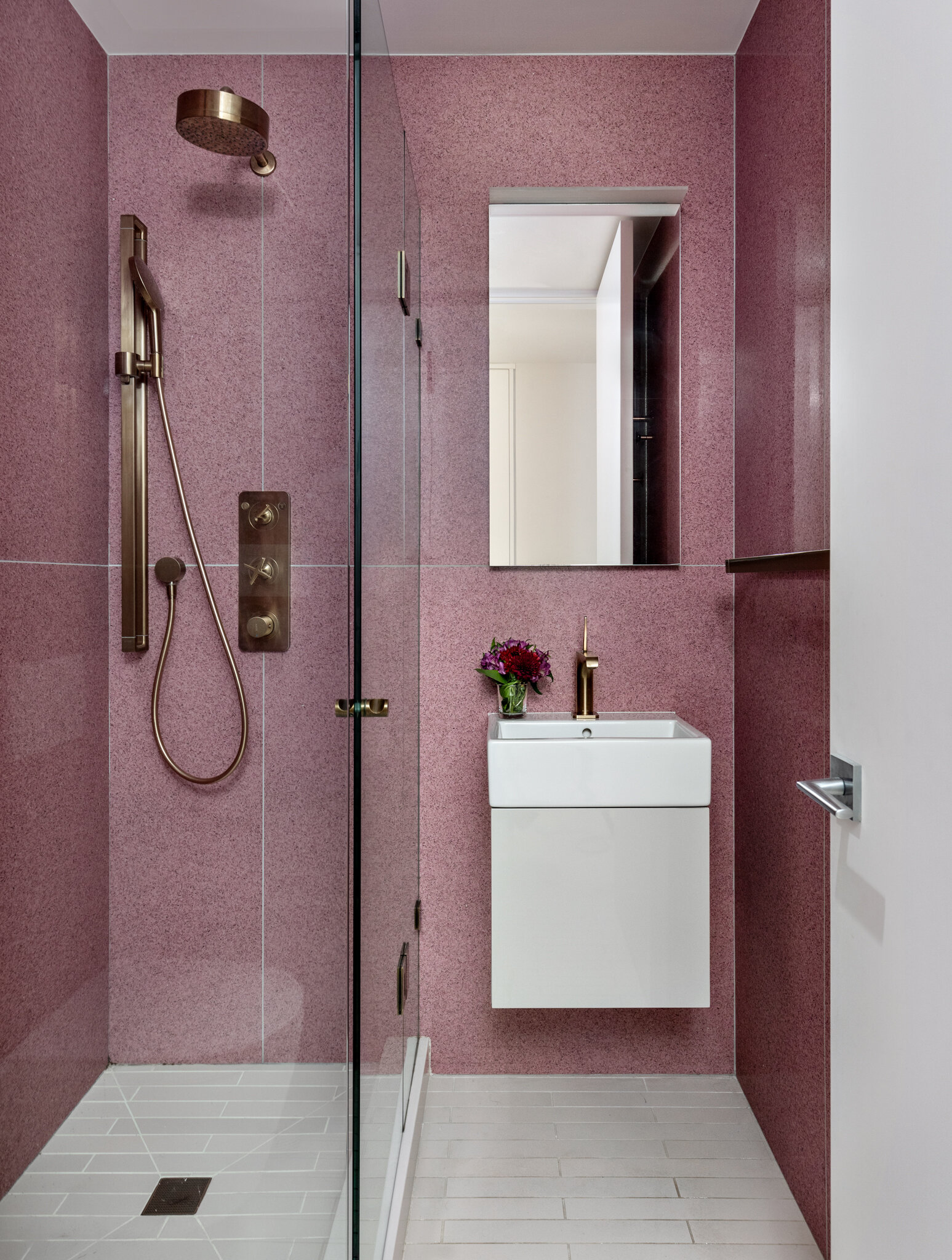
The revised layout achieves a more open flow, allowing southern light to deeply penetrate the apartment. In addition, the design achieves new HVAC + LED lighting throughout, without compromising ceiling heights, washer/dryer, increased storage, transformation of powder room to full bath, a pass through Media/Den that can also be closed for study or sleeping, an open, eat-in kitchen with integrated bar seating and a master suite customized to the owners needs.
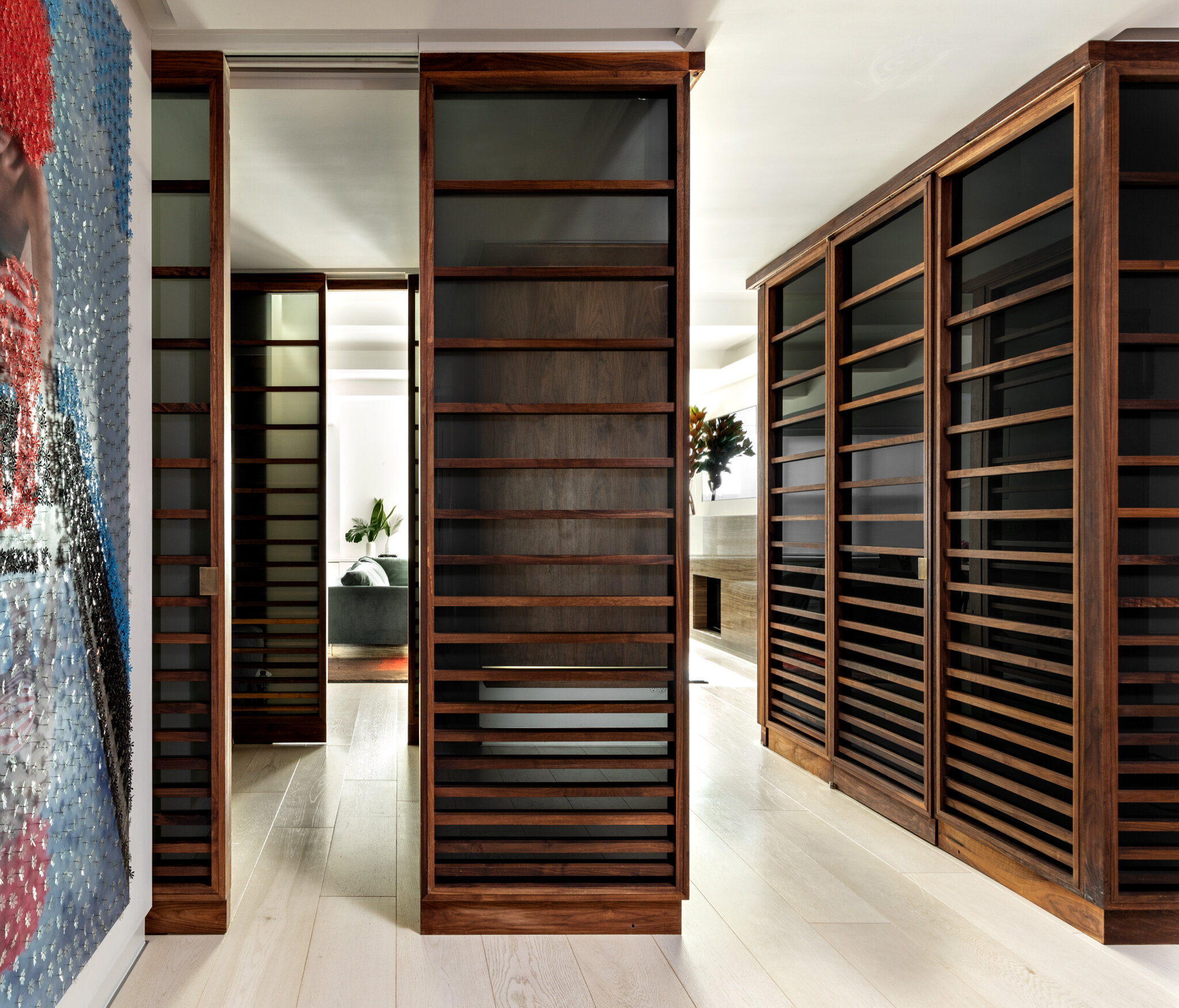
The biggest goal was to increase the living space and to create more connection between the kitchen and family room. Due to restrictions with the building, the location of the kitchen could not be relocated, which is common in New York City, so instead the design team achieved a visual connection and open flow without compromising space and function by creating a hybrid function media room with sliding doors. The central core of the apartment, defined by custom walnut framed gray ombre translucent glass partitions, was designed as the heart of the home, connecting public and private spaces. “With clean white walls and light oak floors to brighten the space, we wanted a transition material that was translucent, warm but also added an element of dimension and luxury to the space. One of our favorite things about designing at this scale is the opportunity to experiment with materiality at this scale. I’m fairly certain that a gradient tempered glass that not only transitions in shade but in level of translucency as it gets darker in shade did not previously exist. We had to do several iterations with the manufacturer to make this work.”
[top row] Looking south towards the living space. [bottom left] Former galley kitchen closed off from the rest of the house. The new layout [bottom right] activates the space with a large peninsula with cooktop and bar seating, facing the eat-in dining area.
Looking towards kitchen from entry corridor.
One of the greatest challenges throughout the process was the integration of the new HVAC without compromising the ceiling heights and exposed beams. The goal was for it to be very streamlined and unnoticeable, which took a lot of onsite coordination between the design team, contractor and engineers.
weetu looks forward to the ongoing relationship with this family for years to come. Thank you to all of those involved with our weetu team [including B-Space + Jonathan Ginnis], X-Act Construction and Patrick Townsend Design. [Photos by Regan Wood Photography].


![[upper left] The previous dining room, now a bedroom, was once a closed off formal room fit for entertaining purposes, while the living room [lower left] acted as formal sitting area. Now, both the living and dining areas are combined to one big ope…](https://images.squarespace-cdn.com/content/v1/5418a782e4b0ca2f107d4f87/1610543683865-G8JVZIBCTALO3U3TDQHS/RIGOS_BEFORE-AFTER-Dining3.jpg)
![[top row] Looking south towards the living space. [bottom left] Former galley kitchen closed off from the rest of the house. The new layout [bottom right] activates the space with a large peninsula with cooktop and bar seating, facing the eat-in din…](https://images.squarespace-cdn.com/content/v1/5418a782e4b0ca2f107d4f87/1610543888760-J1JEY9Z3E43JCNCAI577/RIGOS3.jpg)


