[NEW] YORKVILLE MODERNIZATION
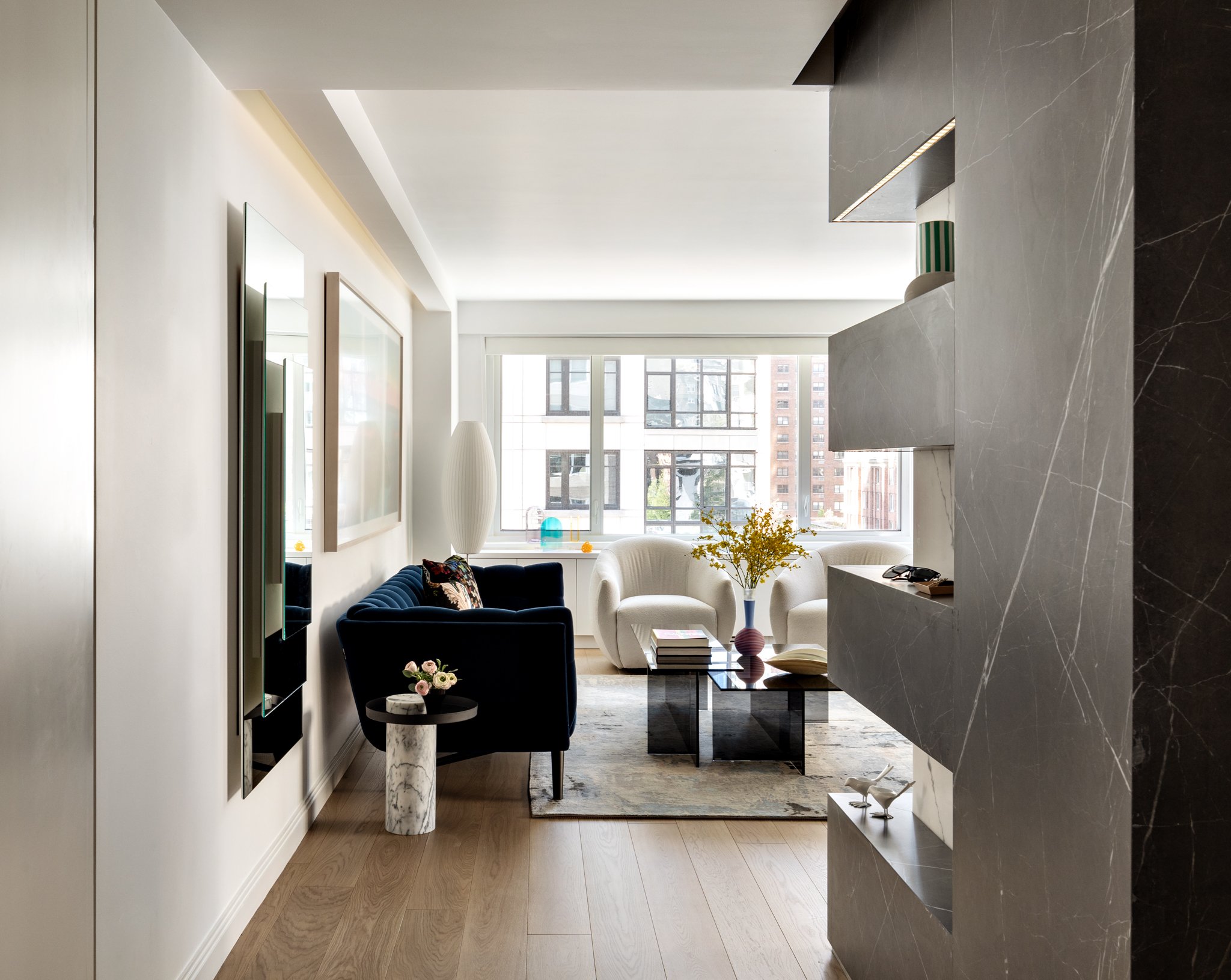
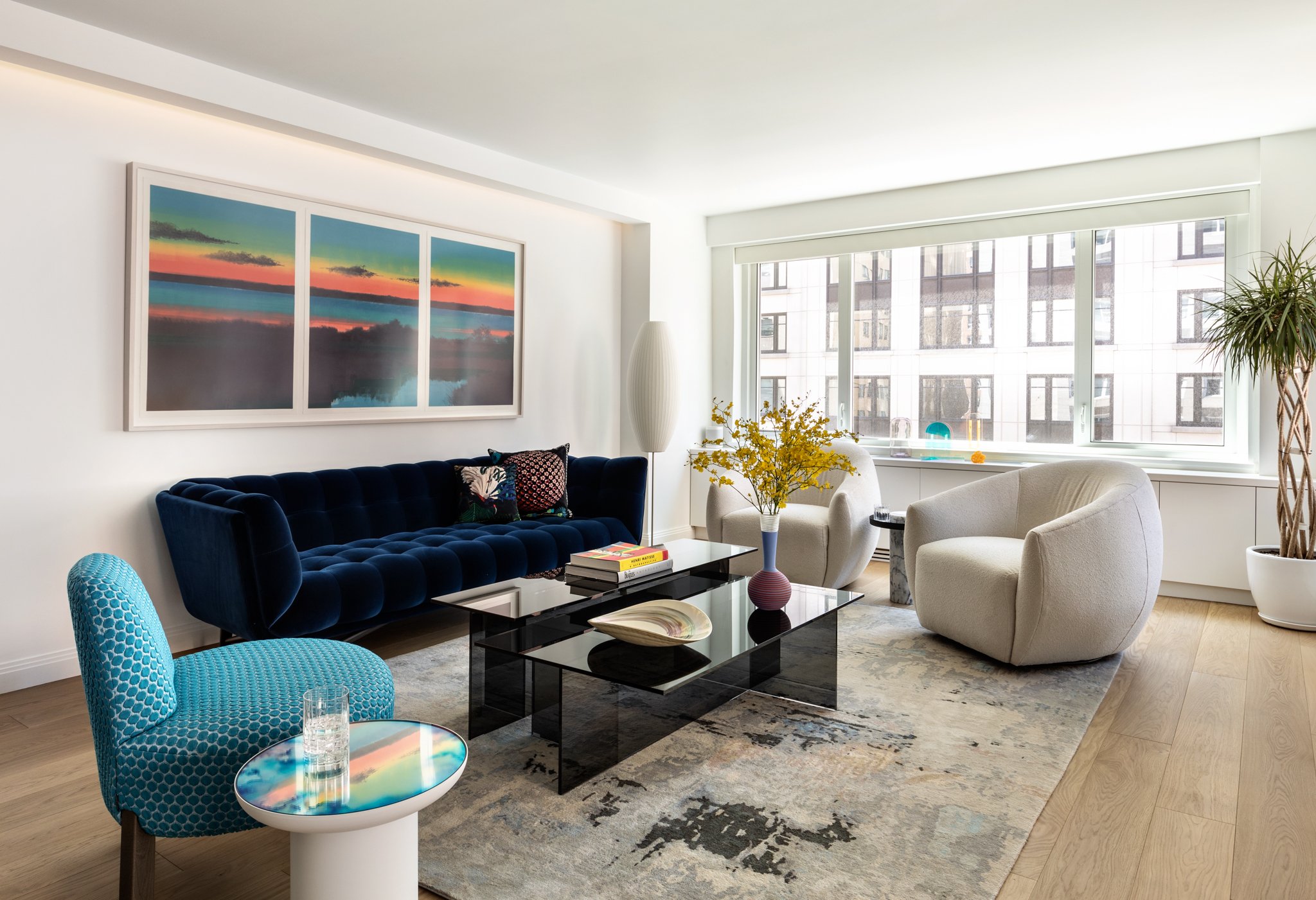
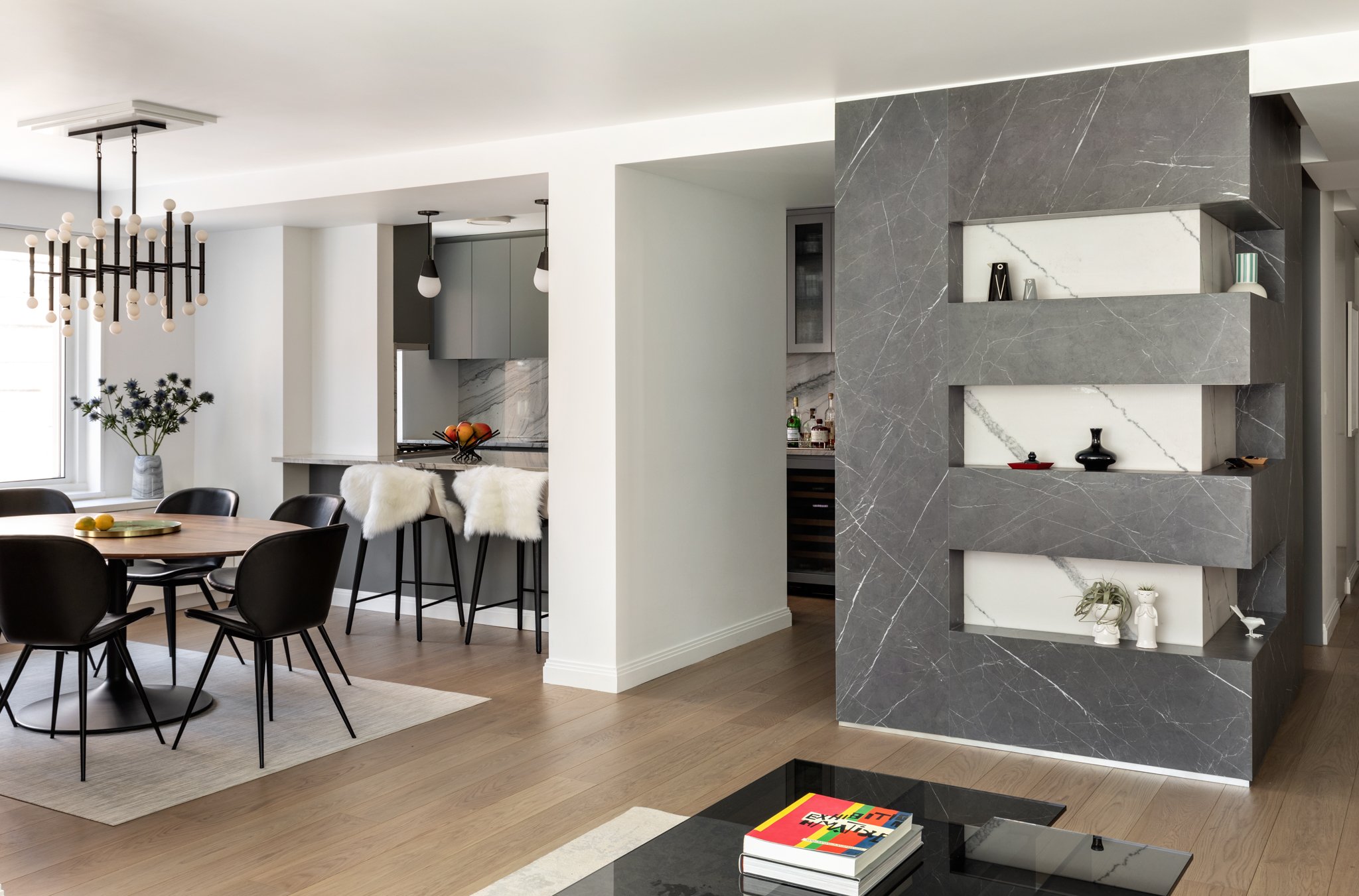
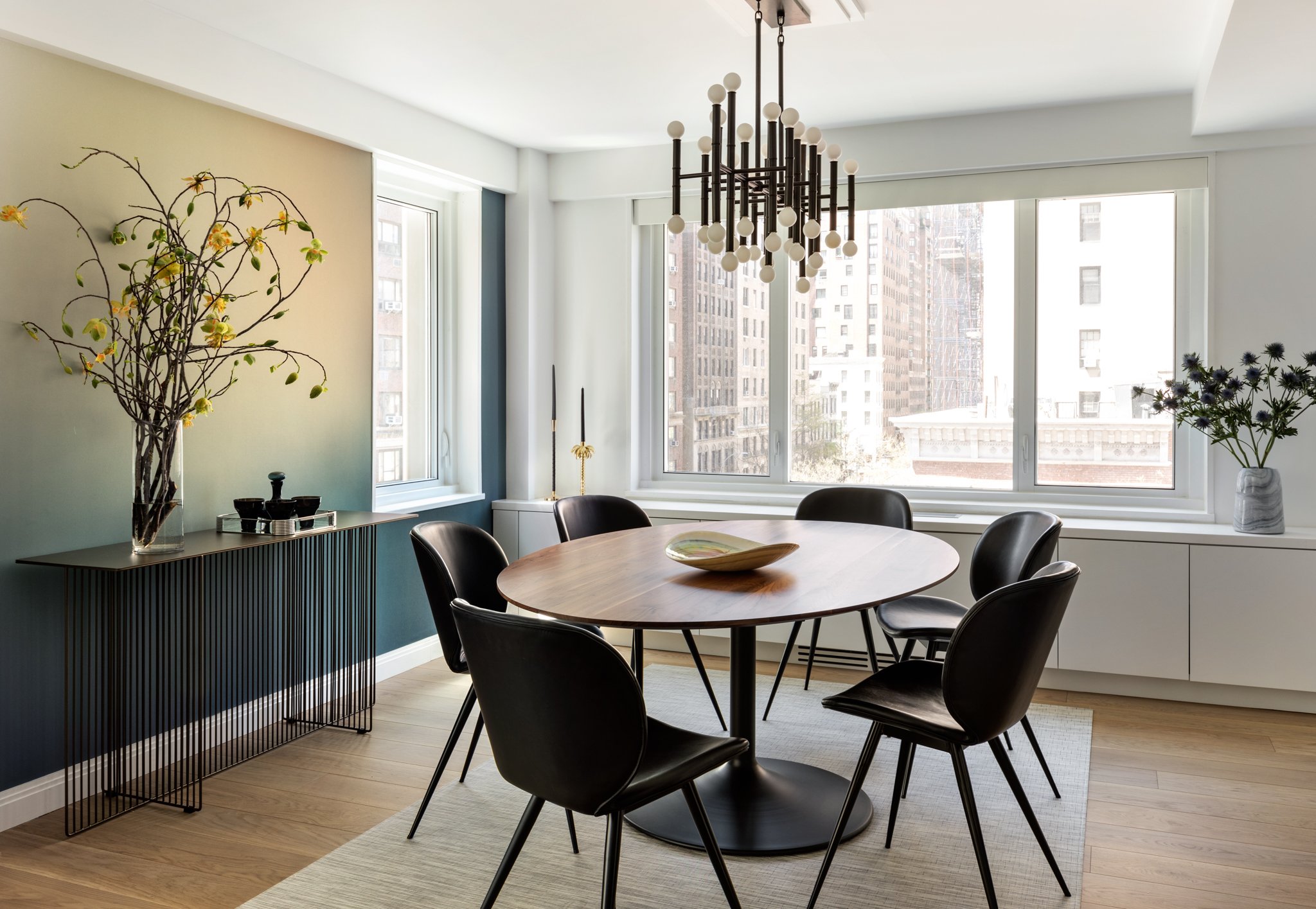
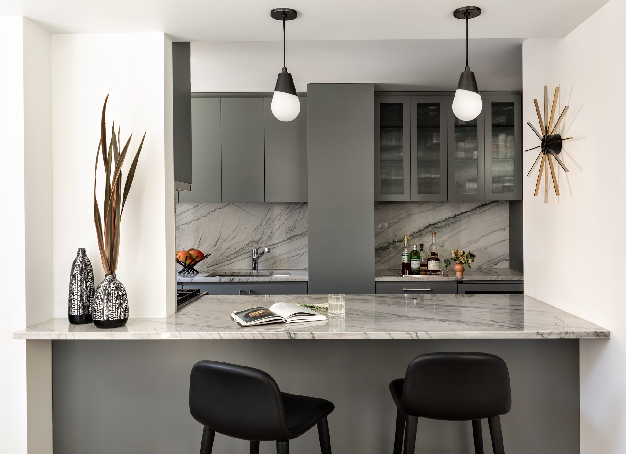
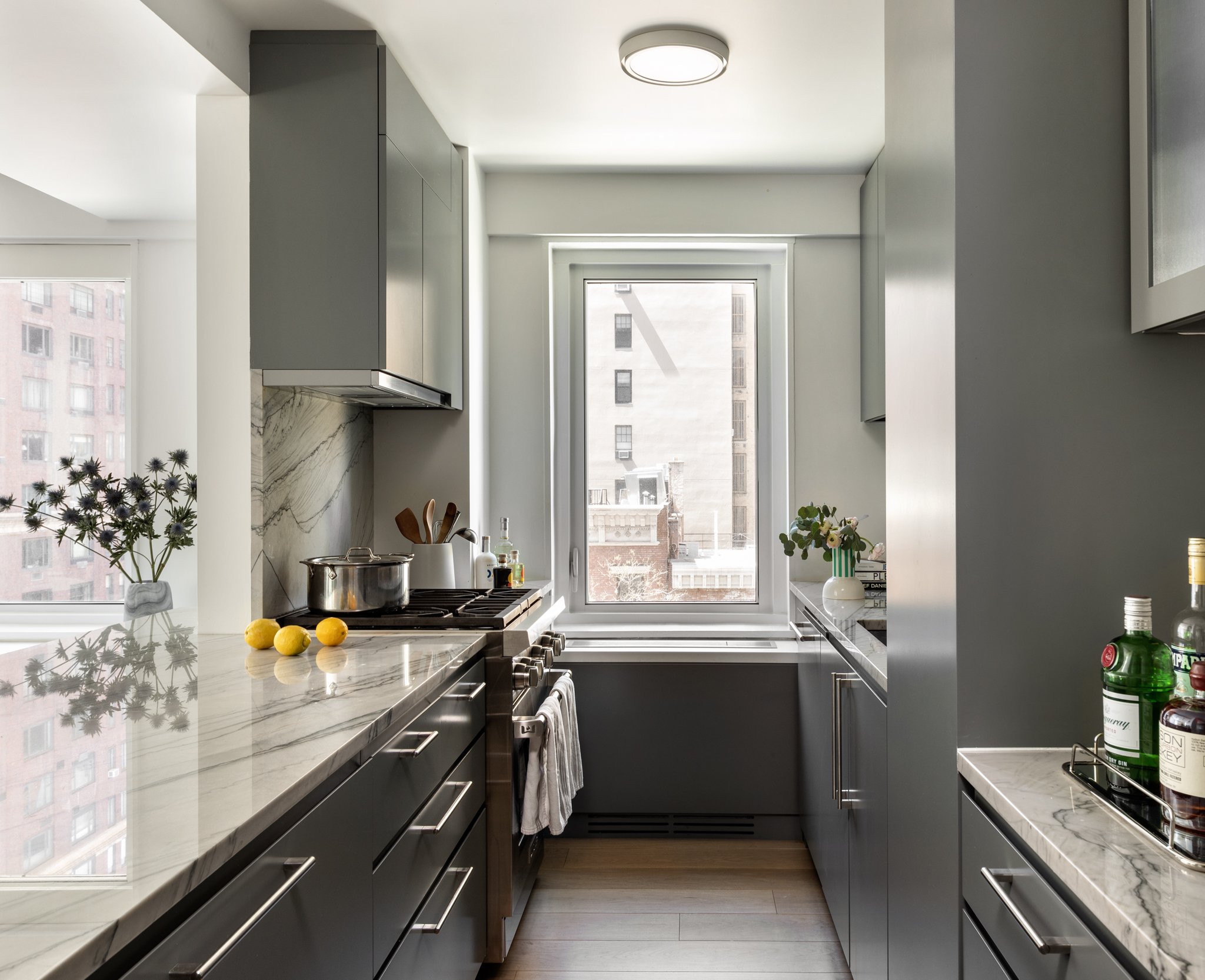
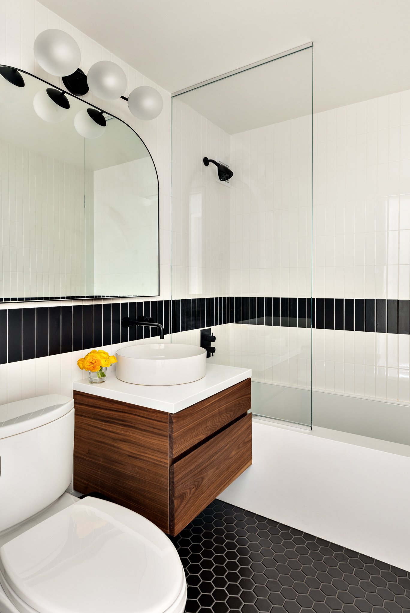
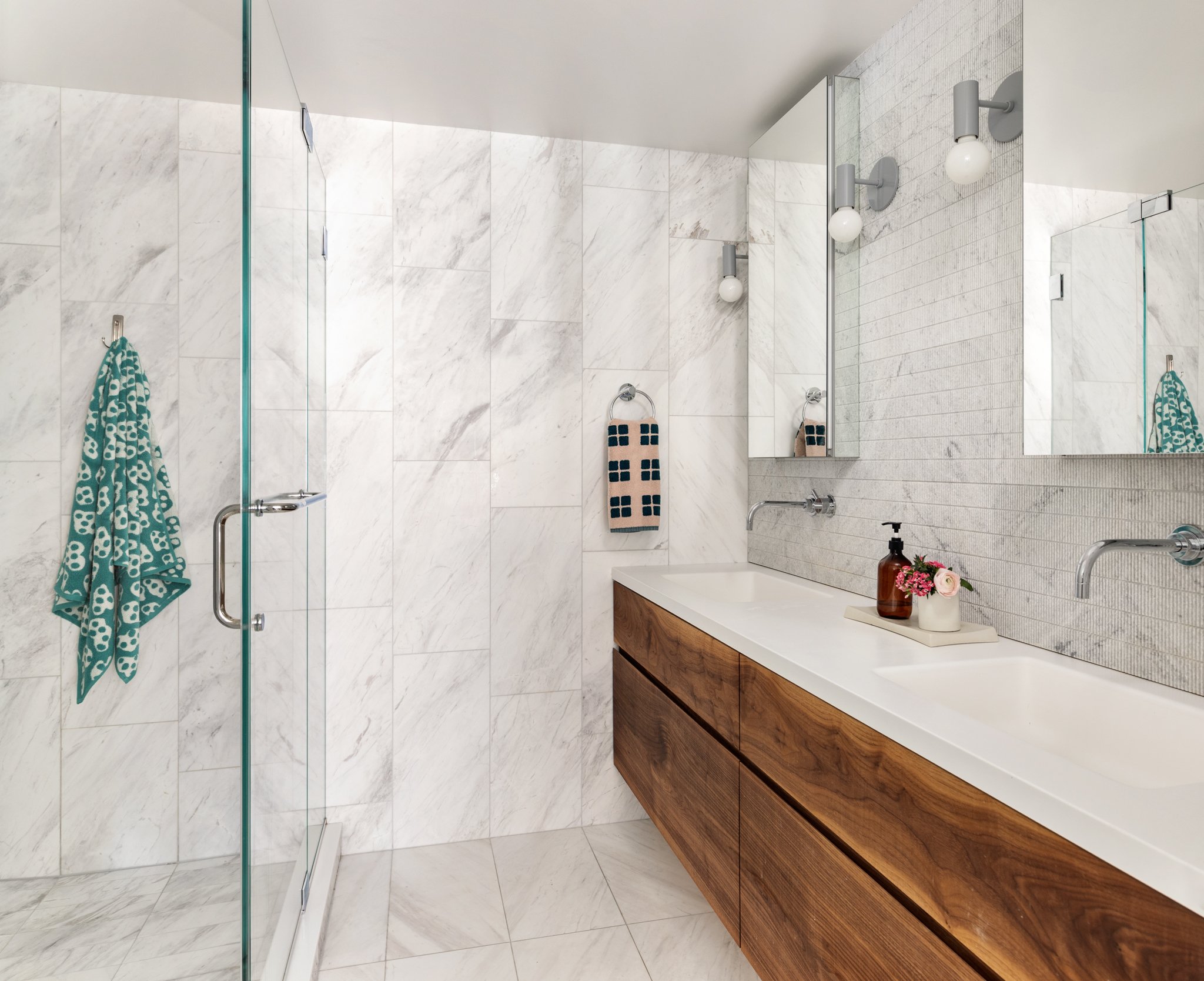
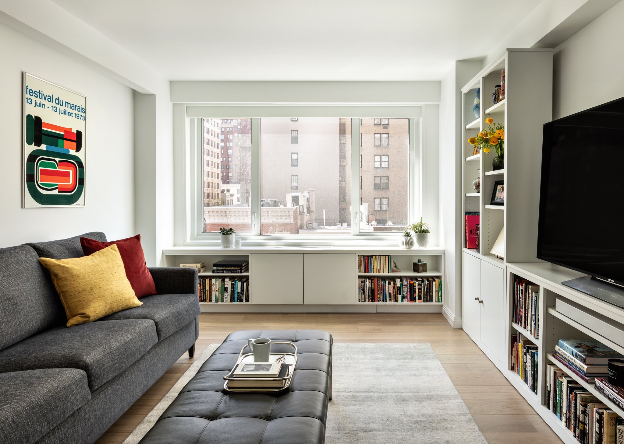
Once a very dated and run down 1960’s Coop apartment, this full gut renovation project results in a warm, playful and airy home for an active couple returning to the city after raising kids in New Jersey.
The revised layout achieves a more open flow, allowing southern light to deeply penetrate the apartment. In addition, the design achieves new HVAC + LED lighting throughout, without compromising ceiling heights, washer/dryer, increased storage, transformation of powder room to full bath, a pass through Media/Den that can also be closed for study or sleeping, an open, eat-in kitchen with integrated bar seating and a master suite customized to the owners needs.
Initially the couple asked for weetu to bring the look of their Jersey home to Manhattan. In working through our process, they were able to visualize their values and the qualities of their concept of home through a new lens, situated on a bustling corner in the upper east side of Manhattan.
““We bought a ‘white box apartment’ and thanks to Carly and her teams’ vision and execution we now have a beautiful home.” ”
The apartment was a full gut renovation and the team was able to stretch every budget dollar effectively to achieve an elevated look on a budget. Near the time of completion, the project was stopped due to the Covid shutdown. “Due to Covid, our gut renovation became a much longer process and was drawn out more than anyone would have anticipated. However, Weetu stayed motivated and focused on reaching the finish line and the results go beyond anything we could have anticipated.” – The Browns
Open living room with spacious conversation area and city views. Wide plank white oak floors and integrated linear LED accent lighting at art feature wall.
Dining Area with custom built-in millwork storage and radiator cover. Gradient wall covering provides warmth and pop of color. [Calico Wallpaper]. Client selected ceiling fixture and dining set.
[Looking from living area towards kitchen] weetu opened up the former narrow galley kitchen to allow for ciruclation flow and visual connection. The stone clad volumetric feature [right] allow for the family’s personalization while concealing the kitchen’s high functioning pantry.


